Phygital retail i Göteborg: hur du designar en butik som synkar med din E-handel
Hur du designar en fysisk butik i Göteborg som samspelar med e-handel, click-and-collect, lager, digital UX och kunddata.
Retail · 2026-05-07
Guide · EOLOS DESIGN LAB Journal
Fysisk retail i Göteborg är inte död. Den har bara blivit för dyr för att fungera som en isolerad butik. När svensk e-handel växer och kundresan börjar online måste varje kvadratmeter i butiken göra mer än att visa produkter. Den måste koppla ihop varumärket, lagret, e-handeln, kunddata och den fysiska upplevelsen.
Det är här många butiker misslyckas. De bygger en vacker miljö och hoppas att e-handeln ska leva bredvid. Men kunden lever inte i två separata världar. Kunden upptäcker produkten på mobilen, jämför pris, läser recensioner, provar i butik, beställer hem, returnerar, hämtar, delar, sparar och förväntar sig att allting känns som samma varumärke.
Phygital retail handlar inte om att skruva upp en skärm på väggen. Det handlar om att rita butiken som en fysisk förlängning av e-handeln.
Göteborgsbutiken måste ha ett nytt jobb
PostNords E-barometer för 2025 beskriver ett svenskt e-handelsår med rekordnivåer och en fortsatt utveckling mot omnikanal. Det betyder inte att den fysiska butiken försvinner. Det betyder att den fysiska butiken måste sluta mäta sitt värde enbart i köp som sker vid kassan.
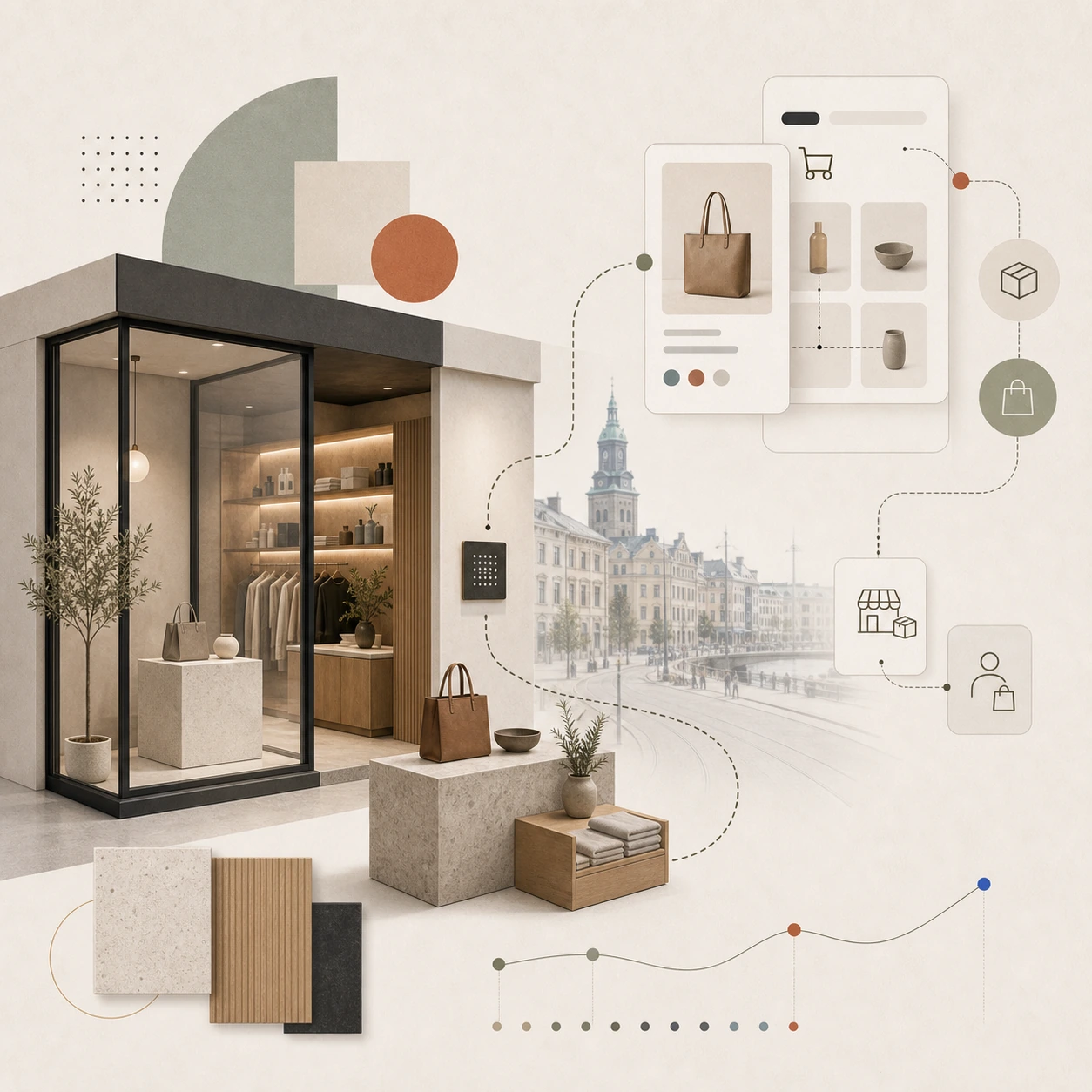
En butik i Göteborg kan fungera som showroom, lokal lagerpunkt, click-and-collect-yta, returloggistik, varumärkesupplevelse, communityyta, rådgivningsmiljö och innehållsstudio. Men då måste arkitekturen stödja de funktionerna. Om alla dessa flöden pressas in i en traditionell butikslayout uppstår friktion.
Friktion syns inte alltid i renderingen. Den syns när kunden inte förstår var ordern hämtas, när personalen måste lämna golvet för att leta lager, när returer skapar kö, när digitala kampanjer inte märks i rummet, eller när butikens bästa produktbilder inte går att återskapa i fysisk miljö.
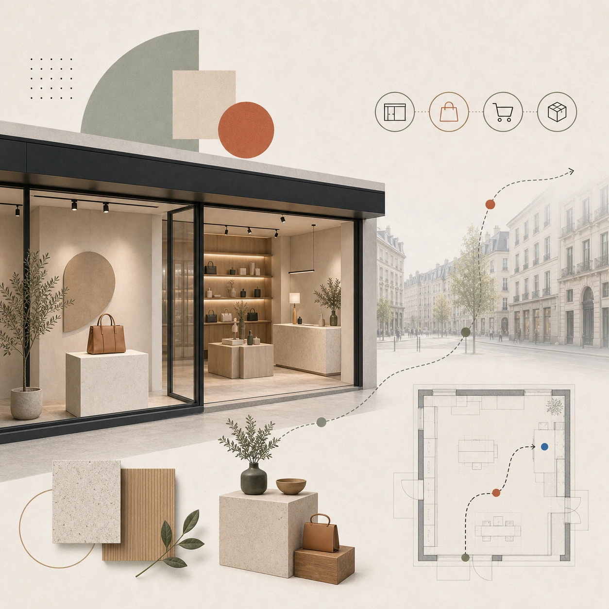
Butikens planritning ska svara på e-handelsdata
En e-handelsplattform visar vad kunder letar efter, vilka produkter som jämförs, vad som läggs i varukorgen, vad som överges och vilka kombinationer som köps tillsammans. Den informationen bör påverka butikens layout.
Om produkt A nästan alltid leder till produkt B online, ska den fysiska butiken inte placera dem slumpmässigt. Om kunder ofta tvekar vid storlek, passform eller material, behöver butiken skapa en tydlig rådgivningspunkt. Om kunder ofta köper online och hämtar i butik, ska click-and-collect-zonen vara snabb men inte död. Den ska ligga så att kunden kan hämta utan irritation, men samtidigt passera rätt ytor för merförsäljning.
Den fysiska kundresan ska inte gissa vad e-handeln redan vet.
Click-and-collect är inte ett hörn bakom kassan
Många butiker behandlar click-and-collect som en logistisk detalj. Det är ett misstag. För en kund som redan har betalat online är upphämtningen ofta den enda fysiska kontakten med varumärket. Om den upplevelsen är förvirrad, långsam eller trång påverkar det hur kunden uppfattar både butiken och e-handeln.
Arkitekturen måste separera flöden utan att separera upplevelsen. Kunden som hämtar ska förstå vart den går direkt. Kunden som provar ska inte störas av returflöden. Personalen ska kunna nå rätt lager utan onödiga steg. Returer ska kunna hanteras utan att kassalinjen kollapsar. Det här är inte bara drift. Det är varumärkesdesign.
En bra phygital butik gör logistiken osynlig och upplevelsen tydlig.
Digitala ytor måste byggas in, inte monteras på
Skärmar, surfplattor, betalpunkter, QR-koder och produktinformation blir snabbt visuellt brus om de adderas efter att inredningen är färdig. Kunden känner direkt när tekniken är ett tillägg. Kablar, fel höjd, dålig placering och svagt innehåll gör att butiken känns mindre premium, inte mer modern.
Digitala kontaktpunkter behöver byggas in i möbler, väggar, provrum, diskar och produktzoner från första skiss. Då kan tekniken stödja beteendet utan att ta över rummet. En digital produktguide ska sitta där beslutet fattas. En betalpunkt ska kännas naturlig i flödet. Ett provrum ska kunna koppla kunden till lagerstatus eller rådgivning utan att bryta integriteten.
Phygital retail är inte futurism. Det är bra UX i fysisk form.
Varumärket måste kännas likadant online och offline
Om e-handeln känns snabb, tydlig och premium men butiken känns rörig, uppstår ett förtroendegap. Om butiken känns exklusiv men webbplatsen är långsam och generisk, tappar varumärket efter besöket. Kunden upplever inte kanalstrategi. Kunden upplever konsekvens eller inkonsekvens.
Material, ljus, typografi, produktfotografi, tonalitet, servicegrad och checkout-logik behöver översättas mellan rummet och skärmen. En phygital butik ska inte kopiera webbplatsen visuellt, men den ska bära samma prioriteringar: tydlighet, tempo, förtroende, orientering och konvertering.
Det är därför en traditionell inredningsarkitekt och en separat webbyrå ofta missar helheten. Den ena ritar rummet. Den andra ritar gränssnittet. Kunden rör sig mellan båda utan att bry sig om vem som ansvarade för vad.
Hur EOLOS arbetar med phygital retail
EOLOS arbetar med kommersiella miljöer där arkitektur, inredning, webb och digitala system behöver planeras tillsammans. För retail betyder det att vi börjar med affären: hur kunden hittar produkten, hur köpet sker, hur upphämtning och retur fungerar, hur personalen arbetar och vilka digitala signaler som måste bli fysiska beslut.
Därefter ritar vi butikens rumsliga logik, materialitet, belysning, digitala kontaktpunkter, click-and-collect, lagerflöden och webbkoppling som en sammanhängande kundresa. Det är samma princip som i vår artikel om Totalentreprenad 2.0: den fysiska lokalen och den digitala lanseringen måste sitta i samma projektlogik.
För en butik i Göteborg är målet inte bara att sälja från hyllan. Målet är att göra hela varumärkets köpresa starkare.
Källor och marknadskontext
PostNords E-barometer Annual Report 2025 beskriver ett rekordår för svensk e-handel, fortsatt omnikanalutveckling och trender som väntas påverka 2026. PostNord sammanfattar även E-barometern på svenska med fokus på aktuella insikter och trender inom e-handel.
Planerar ni en butik, ett showroom eller en retailmiljö? Berätta om projektet via kontaktalternativen nedan.
Physical retail in Gothenburg is not dead. It has just become too expensive to function as an isolated store. As Swedish e-commerce grows and the customer journey moves online, every square meter in the store must do more than display products. It needs to connect the brand, the inventory, e-commerce, customer data and the physical experience.
This is where many shops fail. They build a beautiful environment and hope that e-commerce will live next door. But customers do not live in two separate worlds. The customer discovers the product on mobile, compares price, reads reviews, tries it in store, orders home, returns, picks up, shares, saves and expects everything to feel like the same brand.
Phygital retail is not about screwing a screen to the wall. It's about designing the store as a physical extension of e-commerce.
Gothenburg store must have a new job
PostNord's E-barometer for 2025 describes a Swedish e-commerce year with record levels and a continued development towards omnichannel. This does not mean that the physical store will disappear. It means that the physical store must stop measuring its value solely in purchases made at the checkout.
A store in Gothenburg can function as a showroom, local stock point, click-and-collect area, returns logistics, brand experience, community area, advice environment and content studio. But then the architecture must support those functions. If all these flows are squeezed into a traditional store layout, friction arises.
Friction is not always visible in the rendering. It shows when the customer doesn't understand where the order is being picked up, when staff have to leave the floor to look for stock, when returns create a queue, when digital promotions are not visible in the room, or when the store's best product images cannot be recreated in a physical environment.
Store floor plan to respond to e-commerce data
An e-commerce platform shows what customers are looking for, what products are compared, what is added to the shopping cart, what is abandoned and what combinations are bought together. That information should influence the store layout.
If product A almost always leads to product B online, the physical store should not place them randomly. If customers are often in doubt about size, fit or material, the store needs to create a clear point of advice. If customers often buy online and collect in store, the click-and-collect zone should be fast but not dead. It should be located so that the customer can pick up without irritation, but at the same time pass the right areas for upselling.
The physical customer journey should not guess what e-commerce already knows.
Click-and-collect is not a corner behind the checkout
Many shops treat click-and-collect as a logistical detail. This is a mistake. For a customer who has already paid online, the pick-up is often the only physical contact with the brand. If that experience is confusing, slow or crowded, it affects how the customer perceives both the store and the e-commerce.
The architecture must separate flows without separating the experience. The customer picking up should understand where it goes directly. The customer trying it on should not be disturbed by return flows. Staff should be able to reach the right warehouse without unnecessary steps. Returns should be handled without the checkout line collapsing. This is not just operations. It's brand design.
A good phygital store makes logistics invisible and the experience clear.
Digital surfaces must be built in, not mounted on
Screens, tablets, pay points, QR codes and product information quickly become visual noise if they are added after the interior design is complete. Customers instantly recognize when technology is an add-on. Cables, wrong height, poor placement and weak content make the store feel less premium, not more modern.
Digital touchpoints need to be built into furniture, walls, fitting rooms, counters and product zones from the first sketch. Then technology can support behavior without taking over the space. A digital product guide should sit where the decision is made. A payment point should feel natural in the flow. A fitting room should be able to connect the customer to stock status or advice without breaking privacy.
Phygital retail is not futurism. It's good UX in physical form.
The brand must feel the same online and offline
If the e-commerce feels fast, clear and premium but the store feels cluttered, a trust gap occurs. If the store feels exclusive but the website is slow and generic, the brand loses out after the visit. The customer does not experience channel strategy. Customer experiences consistency or inconsistency.
Materials, lighting, typography, product photography, tonality, service level and checkout logic need to be translated between the room and the screen. A phygital store should not copy the website visually, but it should carry the same priorities: clarity, pace, trust, orientation and conversion.
That's why a traditional interior designer and a separate web agency often miss the big picture. One draws the room. The other draws the interface. The client moves between both without caring who was responsible for what.
How EOLOS works with phygital retail
EOLOS works with commercial environments where architecture, interior design, web and digital systems need to be planned together. For retail, this means starting with the business: how the customer finds the product, how the purchase is made, how pick-up and return work, how staff work and what digital signals need to become physical decisions.
Next, we draw the store's spatial logic, materiality, lighting, digital touchpoints, click-and-collect, stock flows and web connectivity as a coherent customer journey. This is the same principle as in our article on Turnkey 2.0: the physical space and the digital launch must be in the same project logic.
For a store in Gothenburg, the goal is not just to sell off the shelf. The goal is to make the whole brand's shopping journey stronger.
Sources and market context
PostNord E-barometer Annual Report 2025 describes a record year for Swedish e-commerce, continued omnichannel development and trends expected to affect 2026. PostNord also summarizes the E-barometer in Swedish with a focus on current insights and trends in e-commerce.
Planning a shop, showroom or retail environment? Tell us about it using the contact options below.