Det finns en frestelse för nystartade bolag att lösa varumärkesidentiteten snabbt och billigt. En logotyp från en frilansplattform, en färg som kändes rätt en fredagskväll, ett typsnitt som ett bekant föreslog.
Det är förståeligt. Det finns hundra saker som konkurrerar om uppmärksamhet och budget i ett startskede. Varumärket kan vänta.
Det kan det sällan.
Identiteten du väljer i starten formar hur marknaden ser dig, hur du presenterar dig för kunder och investerare, och hur lätt det är att växa utan att behöva göra om allting. Att byta identitet senare, när bolaget är känt, är dyrare och mer komplicerat än att göra det rätt från start.
Vad varumärkesidentitet faktiskt är
Varumärkesidentitet är inte logotypen. Logotypen är ett element i identiteten.
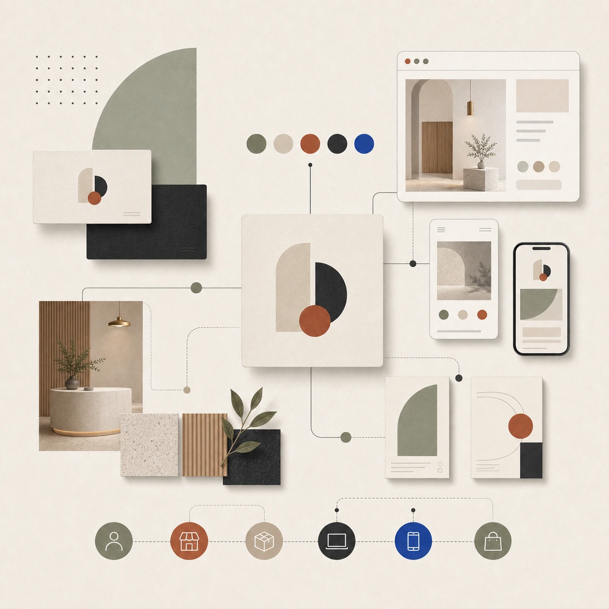
Varumärkesidentitet är summan av alla visuella och kommunikativa beslut som formar hur ditt bolag upplevs: logotyp, typografi, färgpalett, bildspråk, tonalitet, hur du presenterar dig i text, hur din webbplats känns att navigera, hur ditt kontor ser ut när en kund besöker det.
Allt det kommunicerar. Och allt det kommunicerar antingen med en röst, eller med flera röster som drar åt olika håll.
Det senare är det vanliga. Inte för att bolag inte bryr sig, utan för att identitetsbeslut ofta fattas vid olika tidpunkter, av olika personer, utan en gemensam strategi.
Vad som händer när identiteten inte är genomtänkt
En svag eller inkonsekvent identitet skapar konkreta affärsproblem.
Det skapar tveksamhet hos potentiella kunder. Professionalism upplevs, ofta omedvetet, som ett mått på hur seriöst ett bolag är. En logotyp som ser amatörmässig ut, ett färgval som förmedlar fel känsla, en hemsida som inte hänger ihop med hur bolaget kommunicerar på LinkedIn, allt det skapar en diffus känsla av att detta inte riktigt är ett bolag man kan lita på fullt ut.
Det skapar friktion vid investerardialoger. Investerare utvärderar grundarnas förmåga att bygga och kommunicera ett varumärke. En svag identitet signalerar antingen att man inte förstår vikten av det, eller att man inte haft disciplin nog att prioritera det. Ingendera är ett bra signal.
Det skapar intern förvirring. Utan tydliga riktlinjer för hur bolaget kommunicerar fattar olika teammedlemmar sina egna beslut. Det leder till att bolaget ser och låter annorlunda beroende på vem som skrivit ett inlägg, tagit ett foto eller designat en presentation.
Vad en stark visuell identitet faktiskt innehåller
En komplett visuell identitet för ett bolag innehåller ett antal element som alla är kopplat till varandra.
Logotyp och logovariant. Logotypen är fundamentet. Den ska fungera i alla format och skalor: liten i ett email-footer, stor på ett mässmonter, svartvit på ett kuvert. Den ska kommunicera vad bolaget är utan förklaring.
Typografi. Valet av typsnitt är ett av de mest identitetsskapande besluten i en visuell identitet. Typsnitt förmedlar personlighet, epok och position. Det primära typsnittet för rubriker och det sekundära för brödtext ska samspela och fungera i alla relevanta sammanhang.
Färgpalett. En primärfärg, en eller två sekundärfärger och neutraler. Det är vanligtvis tillräckligt. En komplex palett är svår att tillämpa konsekvent, och inkonsekvens är identitetens fiende. Färgerna ska vara definierade i exakta värden: Pantone för tryck, CMYK för offsettryck, RGB och HEX för digitalt.
Bildspråk och fotografi. Vilken typ av bilder kommunicerar bolaget med? Strama produktbilder eller miljöfoto? Porträtt av people eller abstrakta kompositioner? Ljust och luftigt eller mörkt och dramatiskt? Det är designbeslut, inte spontana val.
Ton och kommunikationsriktlinjer. Hur skriver ni? Formellt eller konversationellt? Ni eller du till kunden? Vad undviker ni i kommunikationen? Det ska finnas ett svar, och det ska vara dokumenterat.
Grafiska element och mönster. Ikoner, illustrationer, linjearbete, texturer. De element som skapar igenkänning och som binder samman kommunikationen i olika kanaler.
Identitet och lokalens koppling
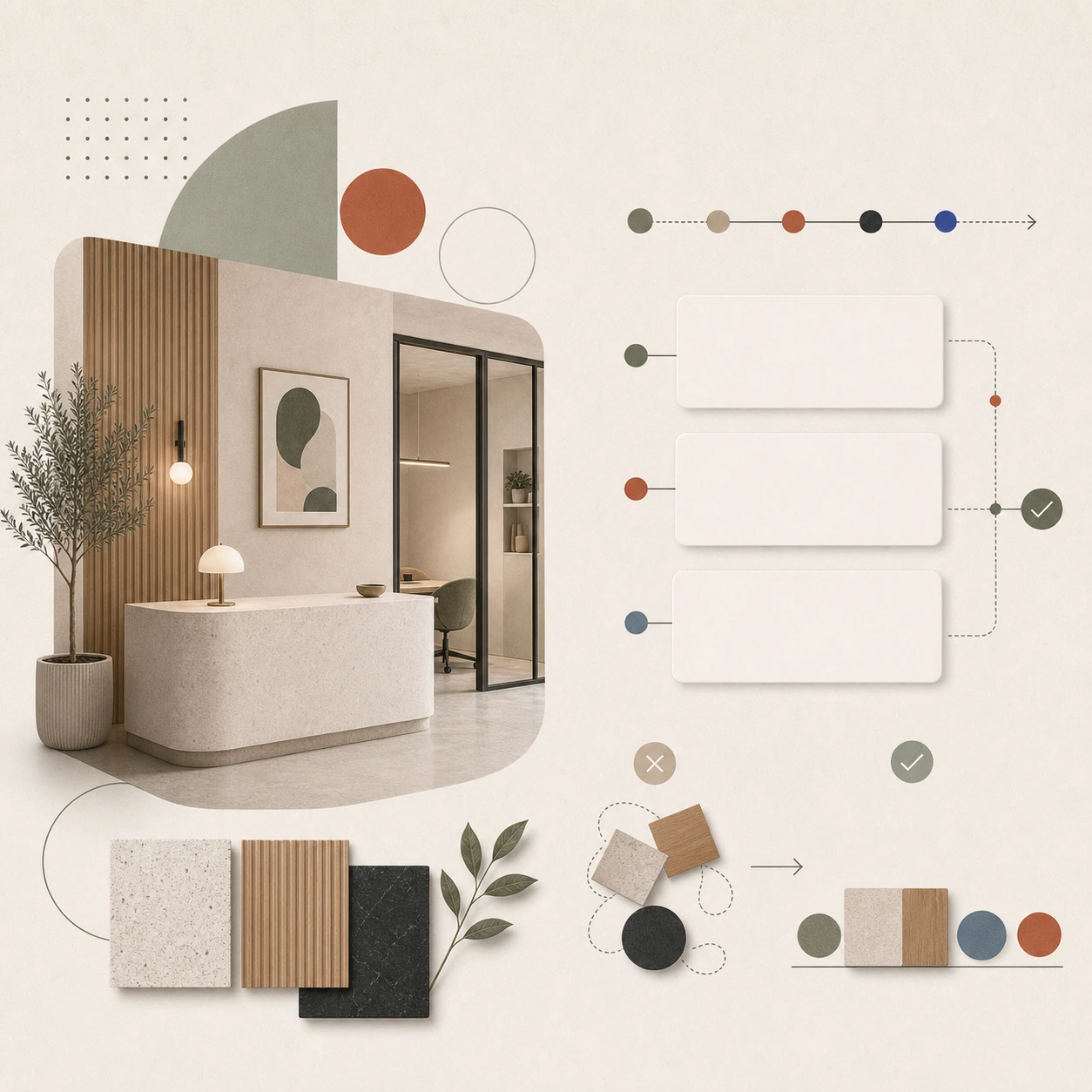
För bolag som har en fysisk lokal, ett kontor, en butik, en restaurang, är den visuella identiteten ofullständig om den inte är integrerad i det fysiska rummet.
Det är den poängen vi gör om och om igen: identiteten slutar inte vid en PDF med brand guidelines. Den ska leva i varje möte med kunden, inklusive, och kanske framför allt, det fysiska mötet.
Ett bolag med en stark visuell identitet som sedan väljer möbler och material utan koppling till den identiteten förlorar en stor del av det de investerat i varumärkesarbetet. Det som borde förstärka varandra motverkar istället.
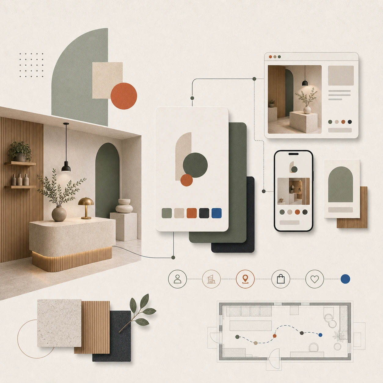
Vi designar identitet och fysisk miljö som ett system, inte som två separata projekt som ska matchas i efterhand.
Hur lång tid tar det att bygga en identitet?
Det beror på projektets scope och på beslutprocessen hos beställaren.
En grundläggande visuell identitet med logotyp, typografi, färgpalett och enkel brand guide kan tas fram på tre till sex veckor om processen är effektiv.
En mer komplett identitet med bildspråk, kommunikationsriktlinjer, webbdesign och fysisk miljö tar tre till sex månader.
Det som tar längst tid är inte designarbetet. Det är beslut. Varumärkesidentitet berör kärnfrågor om vad ett bolag är och vill vara. Det kan ta tid att landa i svaren, och det är OK. Men det är viktigt att inte pausa projektet för länge mitt i processen, för identitetsarbete fungerar bäst som ett kontinuerligt flöde.
Att göra det rätt kontra att göra det snabbt
Det finns en frestelse att ta den snabba vägen: en logotyp från en mall-tjänst, en Canva-skapad hemsida, ett moodboard från Pinterest. Det fungerar i en tidig fas, och det är bättre än ingenting.
Men det fungerar som en provisorisk lösning, inte som ett fundament att bygga vidare på.
Problemet är att ett bolag som fått en svag initial identitet ofta sitter med den länge. Man vänjer sig. Det verkar inte värt att byta nu. Och plötsligt har man levt med en identitet som kommunicerar fel i fem år.
Det är dyrt att rätta till. Det är en process som kräver att man kommunicerar förändringen till marknaden, att befintliga kunder och kontakter uppdateras och att alla kanaler byts om.
Bättre att göra det rätt från start.
Vad ett identitets- och designprojekt med oss innebär
Vi börjar med strategin: vad är det här bolaget, vem vänder det sig till, vad ska det kommunicera och hur ska det uppfattas?
Utifrån det tar vi fram en visuell identitet med logotyp, typografi, färgpalett, bildspråk och riktlinjer. Om projektet inkluderar fysisk miljö, ett kontor, en lokal, ett showroom, integrerar vi identiteten i den designen från start.
Du får en sammanhållen identitet, inte en logotyp och en inredning som ska försöka leva ihop.
Startar du ett nytt bolag eller funderar du på att ta om varumärkesidentiteten från grunden?
Planerar ni ett projekt som behöver samla varumärke, rum och digital närvaro? Berätta om projektet via kontaktalternativen nedan.
There is a temptation for startups to solve their brand identity quickly and cheaply. A logo from a freelance platform, a color that felt right on a Friday night, a font that an acquaintance suggested.
It's understandable. There are a hundred things competing for attention and budget in a startup. The brand can wait.
It rarely can.
The identity you choose at the start shapes how the market sees you, how you present yourself to customers and investors, and how easy it is to grow without having to redo everything. Changing your identity later, when the company is well-known, is more expensive and complicated than doing it right from the start.
What brand identity actually is
Brand identity is not the logo. The logo is an element of the identity.
Brand identity is the sum of all visual and communicative decisions that shape how your company is perceived: logo, typography, color palette, imagery, tonality, how you present yourself in text, how your website feels to navigate, how your office looks when a customer visits it.
All of it communicates. And all of it communicates either with one voice, or with multiple voices pulling in different directions.
The latter is common. Not because companies don't care, but because identity decisions are often made at different times, by different people, without a common strategy.
What happens when identity is not well thought out
A weak or inconsistent identity creates concrete business problems.
It creates hesitation among potential customers. Professionalism is often perceived, unconsciously, as a measure of how serious a company is. A logo that looks amateurish, a color choice that conveys the wrong feeling, a website that does not connect with how the company communicates on LinkedIn, all of which creates a diffuse feeling that this is not really a company that can be fully trusted.
It creates friction in investor dialogues. Investors evaluate the founders' ability to build and communicate a brand. A weak identity signals either that you don't understand the importance of it, or that you haven't had the discipline to prioritize it. Neither is a good signal.
This creates internal confusion. Without clear guidelines for how the company communicates, different team members make their own decisions. This leads to the company looking and sounding different depending on who wrote a post, took a photo, or designed a presentation.
What a strong visual identity actually contains
A complete visual identity for a company contains a number of elements that are all connected to each other.
Logotype and logo variant. The logo is the foundation. It should work in all formats and scales: small in an email footer, large on a trade show booth, black and white on an envelope. It should communicate what the company is without explanation.
Typography. The choice of font is one of the most identity-creating decisions in a visual identity. Fonts convey personality, era and position. The primary font for headlines and the secondary font for body text should interact and function in all relevant contexts.
Color palette. One primary color, one or two secondary colors, and neutrals. That's usually enough. A complex palette is difficult to apply consistently, and inconsistency is the enemy of identity. Colors should be defined in precise values: Pantone for print, CMYK for offset, RGB and HEX for digital.
Imagery and photography. What type of images does the company communicate with? Strict product images or environmental photos? Portraits of people or abstract compositions? Light and airy or dark and dramatic? These are design decisions, not spontaneous choices.
Tone and communication guidelines. How do you write? Formal or conversational? You or you to the customer? What do you avoid in communication? There should be an answer, and it should be documented.
Graphic elements and patterns. Icons, illustrations, line work, textures. The elements that create recognition and that tie together communication across different channels.
Identity and the connection of the premises
For companies that have a physical location, an office, a store, a restaurant, the visual identity is incomplete if it is not integrated into the physical space.
That's the point we make over and over again: identity doesn't end with a PDF of brand guidelines. It should live on in every encounter with the customer, including, and perhaps most importantly, the physical encounter.
A company with a strong visual identity that then chooses furniture and materials without a connection to that identity loses a large part of what they have invested in branding. What should reinforce each other instead counteracts.
We design identity and physical environment as a system, not as two separate projects that need to be matched afterwards.
How long does it take to build an identity?
It depends on the scope of the project and the decision-making process of the client.
A basic visual identity with logo, typography, color palette and simple brand guide can be developed in three to six weeks if the process is efficient.
A more complete identity with imagery, communication guidelines, web design and physical environment takes three to six months.
What takes the longest isn’t the design work. It’s the decisions. Brand identity touches on core questions about what a company is and wants to be. It can take time to land on the answers, and that’s OK. But it’s important not to pause the project for too long in the middle of the process, because identity work works best as a continuous flow.
Doing it right versus doing it quickly
There’s a temptation to take the quick route: a logo from a template service, a Canva-created website, a moodboard from Pinterest. It works in the early stages, and it’s better than nothing.
But it works as a temporary solution, not as a foundation to build on.
The problem is that a company that has been given a weak initial identity often sticks with it for a long time. You get used to it. It doesn't seem worth changing now. And suddenly you've been living with an identity that communicates incorrectly for five years.
It is expensive to fix. It is a process that requires communicating the change to the market, updating existing customers and contacts, and changing all channels.
Better to do it right from the start.
What an identity and design project with us involves
We start with the strategy: what is this company, who is it aimed at, what should it communicate and how should it be perceived?
From there, we develop a visual identity with logotype, typography, color palette, imagery and guidelines. If the project includes a physical environment, an office, a premises, a showroom, we integrate the identity into that design from the start.
You get a cohesive identity, not a logo and interior design that try to coexist.
Are you starting a new company or are you thinking about redesigning your brand identity from scratch?
Planning a project that needs to align brand, space and digital presence? Tell us about it using the contact options below.